The Client Request
Simply design new posters that would replace the existing “values” posters throughout the company.
Discovery Phase
We toured the factory and offices to see where the existing
posters were placed and discovered many things.
The current posters were plain, uninspiring, and blended into the environment. Even though employees walked by them every day, they went unnoticed or ignored.
The first part of the new positioning statement states, “Bradford creates and delivers innovative products and services….” We noted that the overall visual effect of most areas in the facility were monochromatic and lacking life and energy. The facility did not reflect creativity or innovation.
The second part of Bradford’s new positioning statement communicated that they “helped companies build great brands.” On our tour, however, we noted that Bradford branding was minimal or nonexistent throughout most of the environment.
We set out to understand how employees would naturally express each new core belief.
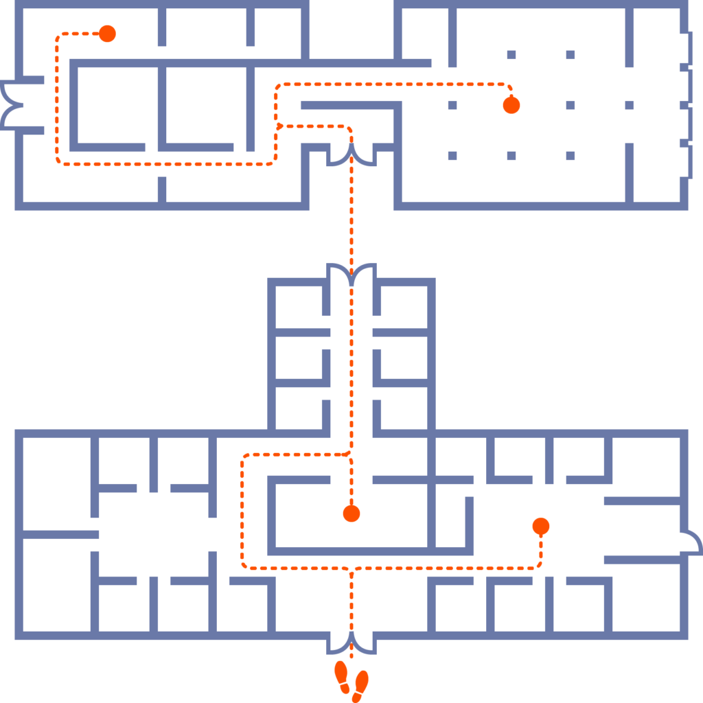
We mapped the most common journeys of both customers and employees in the various buildings on their campus.
We reviewed how the company currently communicated to employees to understand all the opportunities we could take advantage of to reach them.
Major
Take-Away
The requested poster was not the most effective way to deliver and have employees and customers connect to these important messages.
![]()
OK,
so now what?
First, we diagramed the customer and employee journey at the RI facility.
Next, we:
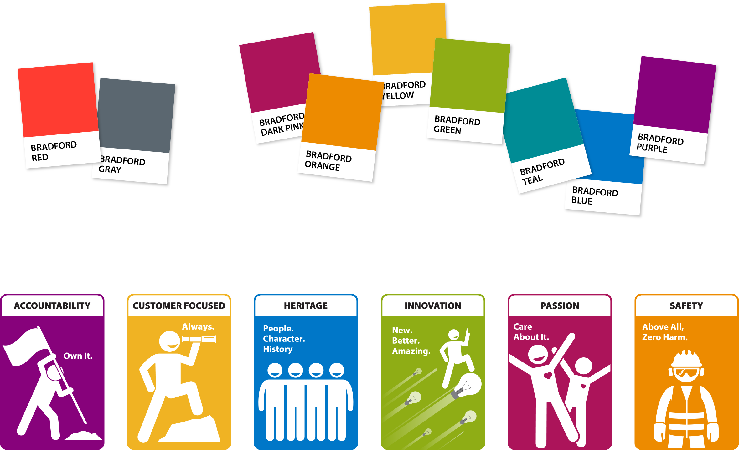
- Extended the brand identity color palette to represent active and energetic creativity and innovation.
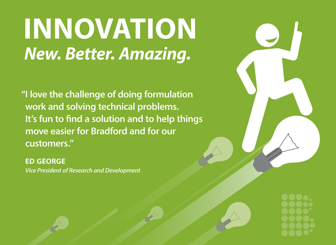
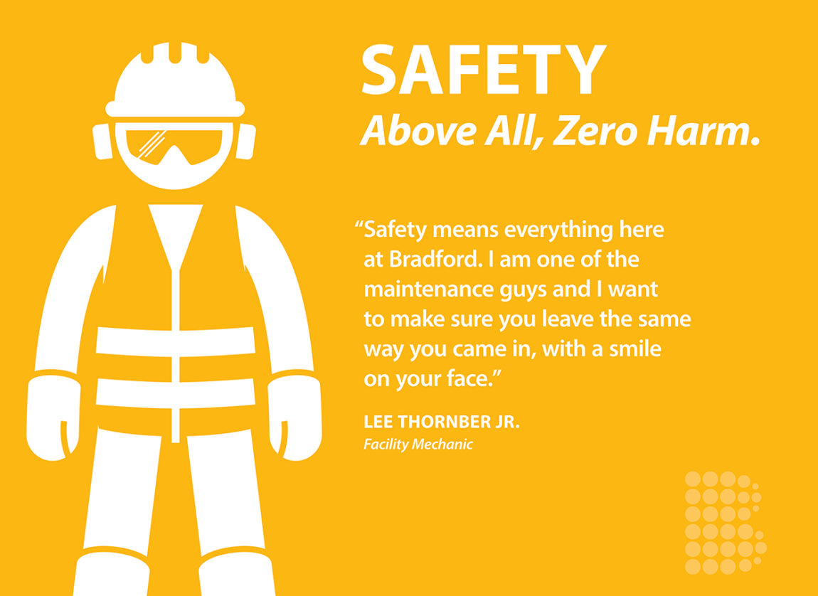
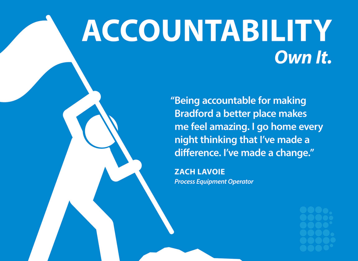
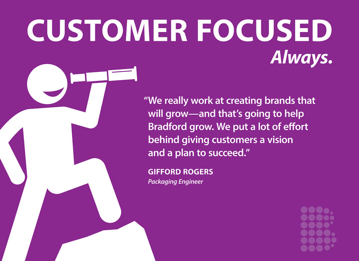
- Developed a visual identity system that activated the values in engaging ways using manufacturing icons in creative ways.
- Interviewed employees to collect quotes for how they naturally expressed the core beliefs in their own words.
- Designed graphics using employee quotes of the core beliefs as well as facts about Bradford’s innovation to be displayed on the walls of the most traveled areas.
- Designed a system for displaying graphics on facility’s walls using magnetic materials so the graphics could be changed and moved to remain fresh and recognized over time.
- Designed experiences and visuals for the most traveled pathways in the buildings for both customers and employees.
- Used the new brand colors to paint accent walls and activate the space.
- Used ‘Bradford Red’ and the positioning statement on key walls that customers would see.
- Designed t-shirts for the annual company BBQ where each employee could choose the core beliefs they most wanted to wear to work (as uniform).
- Designed a printed brochure introducing Stu Benton as the new president as well as the new positioning statement and core beliefs to be distributed to employees and customers.

